Solved Examples: Measures of Position


Samuel Dominic Chukwuemeka (SamDom For Peace) For ACT Students
The ACT is a timed exam...60 questions for 60 minutes
This implies that you have to solve each question in one minute.
Some questions will typically take less than a minute a solve.
Some questions will typically take more than a minute to solve.
The goal is to maximize your time. You use the time saved on those questions you solved in less than a minute, to solve the questions that will take more than a minute.
So, you should try to solve each question correctly and timely.
So, it is not just solving a question correctly, but solving it correctly on time.
Please ensure you attempt all ACT questions.
There is no negative penalty for any wrong answer.

For SAT Students
Any question labeled SAT-C is a question that allows a calculator.
Any question labeled SAT-NC is a question that does not allow a calculator.

For JAMB Students
Calculators are not allowed. So, the questions are solved in a way that does not require a calculator.

For WASSCE Students
Any question labeled WASCCE is a question for the WASCCE General Mathematics
Any question labeled WASSCE-FM is a question for the WASSCE Further Mathematics/Elective Mathematics

For NSC Students
For the Questions:
Any space included in a number indicates a comma used to separate digits...separating multiples of three digits from behind.
Any comma included in a number indicates a decimal point.
For the Solutions:
Decimals are used appropriately rather than commas
Commas are used to separate digits appropriately.

Solve all questions.
Show all work.

(1.) Students A, B, C, D, and E had their SAT (Scholastic Assessment Test) scores converted to z-scores.
Their z-scores are −2.00, −1.00, 0.00, 1.00, and 2.00 respectively.
Who made the highest of the five scores?


Student $E$ made the highest test score because the score is $2.00$ standard deviations above the mean.
(2.) Two friends Agnes and Agatha were arguing on who made the better score.
Agnes made a 73% on her Chemistry test while Agatha made a 46% on her Biology test.
The Biology test scores have a mean of 65% and a standard deviation of 10%, while the Chemistry test scores have a mean of 95% and a standard deviation of 11%.
Who made the better score?


$ z = \dfrac{x - \mu}{\sigma} \\[5ex] \underline{Agnes'\:\:Chemistry\:\:Test} \\[3ex] x = 73 \\[3ex] \mu = 95 \\[3ex] \sigma = 11 \\[3ex] z = \dfrac{73 - 95}{11} \\[5ex] z = -\dfrac{22}{11} \\[5ex] z = -2.00 \\[3ex] \underline{Agatha's\:\:Biology\:\:Test} \\[3ex] x = 46 \\[3ex] \mu = 65 \\[3ex] \sigma = 10 \\[3ex] z = \dfrac{46 - 65}{10} \\[5ex] z = -\dfrac{19}{10} \\[5ex] z = -1.90 \\[3ex] -1.90 \gt -2.00 \\[3ex] $ Therefore, Agatha's Biology test score is better because it has a higher $z-score$ than Agnes' Chemistry test score.

Note the responses of your students.
If some of them said that Agnes' test score was better, re-teach the concept of $z-scores$
(3.) IQ (Intelligence Quotient) scores are measured with a test designed so that the mean is 107 and the standard deviation is 19.

(a.) What are the z-scores that separate the unusual IQ scores from the usual IQ scores?

(b.) What are the IQ scores that separate the unusual IQ scores from the usual IQ scores?


(a.) A data score is usual if $-2.00 \le z \le 2.00$
A data value is unusual if the $z-score \lt -2.00$ OR the $z-score \gt 2.00$
The lower $z-score$ boundary is $-2.00$
The upper $z-score$ boundary is $2.00$
This implies that $-2.00$ and $2.00$ are the $z-scores$ that separate the unusual $IQ$ scores from the usual $IQ$ scores

(b.) To find the $IQ$ scores (data values), we need to express them in terms of the $z-scores$.

$ z = \dfrac{x - \mu}{\sigma} \\[5ex] \rightarrow x - \mu = z\sigma \\[3ex] x = z\sigma + \mu \\[3ex] Lower\:\:IQ\:\:score\:\:boundary = -2(19) + 107 = -38 + 107 = 69 \\[3ex] Upper\:\:IQ\:\:score\:\:boundary = 2(19) + 107 = 38 + 107 = 145 \\[3ex] Usual\:\:IQ\:\:scores:\:\: 69 \le IQ \le 145 \\[3ex] Unusual\:\:IQ\:\:scores:\:\: IQ \lt 69 \:\:OR\:\: IQ \gt 145 \\[3ex] $ Therefore 69 and 145 are the IQ scores that separate the unusual IQ scores from the usual IQ scores
(4.) At one time, President Barack Obama had a net worth of 3,670,505.00
The 17 members of the Executive Branch had a mean net worth of 4,939,455.00 with a standard deviation of 7,775,948.00 (OpenSecrets.org)
(a.) What is the difference between the mean net worth of all the Executive Branch members and President Obama's net worth?
(b.) How many standard deviations is the difference?
(c.) What are the z-score of President Obama's net worth?
(d.) Is President Obama's net worth usual or unusual?


$ (a.)\:\: Difference = 4939455 - 3670505 = \$1,268,950.00 \\[3ex] (b.)\:\: x = 4939455 \\[3ex] \mu = 3670505 \\[3ex] \sigma = 7775948 \\[3ex] z = \dfrac{x - \mu}{\sigma} \\[5ex] z = \dfrac{4939455 - 3670505}{7775948} \\[5ex] z = \dfrac{1268950}{7775948} \\[5ex] z = 0.16 \\[3ex] The\:\:difference\:\:is\:\:0.16\:\:standard\:\:deviations \\[3ex] (c.)\:\: \underline{Obama's\:\:worth} \\[3ex] x = 3670505 \\[3ex] \mu = 4939455 \\[3ex] \sigma = 7775948 \\[3ex] z-score = \dfrac{3670505 - 4939455}{7775948} \\[5ex] z-score = -\dfrac{1268950}{7775948} \\[5ex] z-score = - 0.1631891057 \\[3ex] z-score \approx -0.16 \\[3ex] (d.)\:\:Because -2.00 \le -0.16 \le -2.00 \\[3ex] $ Obama's net worth is usual.
(5.) Timothy surveyed 36 adults in the City of Truth or Consequences, New Mexico.
He sorted their ages (in years) as seen in the data below:

Ages
18 20 20 22 23 25 27 30 31 32 36 37
38 40 40 41 43 44 48 49 49 55 56 58
61 63 63 65 69 70 70 70 71 76 77 80

Determine and interpret the quantiles of 65 years.


Sample size = total number of values = n = 36
Number of data values less than 65 = 27

$ Percentile\;\;of\;\;65 \\[3ex] = \dfrac{27}{36} * 100 \\[5ex] = \dfrac{2700}{36} \\[5ex] = 75th\;\;percentile \\[3ex] $ This means that 75% of the ages are lower than 65 years while 25% of the ages are higher than 65 years.
Alternatively, we can say that if the ages is divided into 100 parts; the age, 65 years separates the lowest 75% of the ages from the highest 25%.

$ Decile\;\;of\;\;65 \\[3ex] = \dfrac{27}{36} * 10 \\[5ex] = \dfrac{270}{36} \\[5ex] = 7.5th\;\;decile \\[3ex] $ If the ages dataset is divided in 10 parts, 65 years separates the lowest 7.5 of the ages from the highest 2.5.

$ Quintile\;\;of\;\;65 \\[3ex] = \dfrac{27}{36} * 5 \\[5ex] = \dfrac{135}{36} \\[5ex] = 3.75th\;\;quintile \\[3ex] $ If the ages dataset is divided in 5 parts, 65 years separates the lowest 3.75 of the ages from the highest 1.25.

$ Quartile\;\;of\;\;65 \\[3ex] = \dfrac{27}{36} * 4 \\[5ex] = \dfrac{108}{36} \\[5ex] = 3rd\;\;quartile \\[3ex] $ If the ages dataset is divided in 4 parts, 65 years separates the lowest 3 of the ages from the highest 1.
(6.) Using the Ages dataset in Question Number (5.), determine the: 75th percentile, 7.5th decile, 3.75th quintile, and the 3rd quartile.


$ n = 36 \\[3ex] xth\;\;position = \dfrac{75}{100} * 36 = \dfrac{2700}{100} = 27 \\[5ex] xth\;\;position = \dfrac{7.5}{10} * 36 = \dfrac{270}{10} = 27 \\[5ex] xth\;\;position = \dfrac{3.75}{5} * 36 = \dfrac{135}{5} = 27 \\[5ex] xth\;\;position = \dfrac{3}{4} * 36 = \dfrac{108}{4} = 27 \\[5ex] \implies \\[3ex] xth\;\;position \\[3ex] = \dfrac{27th\;\;position + 28th\;\;position}{2} \\[5ex] = \dfrac{63 + 65}{2} \\[5ex] = \dfrac{128}{2} \\[5ex] = 64 \\[3ex] $ 75th percentile = 7.5th decile = 3.75th quintile = 3rd quartile = 64

Student: Mr. C, are we not supposed to get 65 as the answer?
Teacher: Yes. But we got 64. This is the correct answer.
I want you to see it this way: 64 is the boundary for the 3rd quartile (75th percentile)
65 is included in that part. But 64 is the boundary.
Be it as it may: please
NOTE: Some textbooks/online resources calculate these formulas (formulas that deal with converting a quantile to a data value) differently.
They may have it this way:

$ xth\:\:position = \dfrac{yth\:\:Percentile}{100} * (total\:\:number\:\:of\:\:values + 1) \\[5ex] $ If we use this formula, we will get the answers we got in Question Number (5.) (which we makes sense).
However, if we decide to calculate the median of that data with this formula, it will be different from the median value calculated with the formulas in the link above (main formulas).
There is still some confusion that the main formulas should only apply to the median.
Be it as it may, please use the main formulas (which is provided for you on the tests/exams)
(7.) Data were collected on the total energy consumption per capita​ (in million​ BTUs) for some states.
A summary of the data is shown in the table below.
Summary Statistics:
Column Min Q1 Median Q3 Max
Total BTU 185.5 242.9 304.7 392.8 912.7

(a.) What percentage of the states consumed more than 392.8 million BTUs per​ capita?
(b.) What percentage of the states consumed more than 242.9 million BTUs per​ capita?
(c.) What percentage of the states consumed more than 304.7 million BTUs per​ capita?
(d.) Determine the interquartile range.
(e.) Interpret the interquartile range in the context of the dataset.


(a.) 392.8 million BTU = Q3 = 75%
More than 75% = 100% = 75% = 25%
25% of the states consumed more than 392.8 million BTUs per capita.

(b.) 242.9 million BTUs = Q1 = 25%
More than 25% = 100% - 25% = 75%
75% of the states consumed more than 242.9 million BTUs per capita.

(c.) 304.7 million BTUs = Q2 = Median = 50%
More than 50% = 100% - 50% = 50%
50% of the states consumed more than 304.7 million BTUs per capita.

$ (d.) \\[3ex] IQR = Q_3 - Q_1 \\[3ex] IQR = 392.8 - 242.9 = 149.9\;million\;BTUs \\[3ex] $ (e.) Interpretation of IQR: The middle​ 50% of the states have values of total energy consumption per capita that vary by as much 149.9 million BTUs.
(8.) ACT For a given set of data, the standard score, z, corresponding to the raw score, x, is given by $z = \dfrac{x - \mu}{\sigma}$, where μ is the mean of the set and σ is the standard deviation.
If, for a set of scores, μ = 78 and σ = 6, which of the following is the raw score, x, corresponding to z = 2?

$ F.\;\; 90 \\[3ex] G.\;\; 84 \\[3ex] H.\;\; 80 \\[3ex] J.\;\; 76 \\[3ex] K.\;\; 66 \\[3ex] $

$ \mu = 78 \\[3ex] \sigma = 6 \\[3ex] z = 2 \\[3ex] x = ? \\[3ex] z = \dfrac{x - \mu}{\sigma} \\[5ex] x - \mu = z * \sigma \\[3ex] x = z * \sigma + \mu \\[3ex] x = 2 * 6 + 78 \\[3ex] x = 12 + 78 \\[3ex] x = 90 $
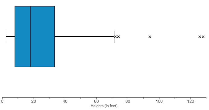
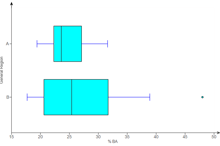
(9.) The boxplot displayed shows the average ticket price for four professional sports leagues.

Number 9

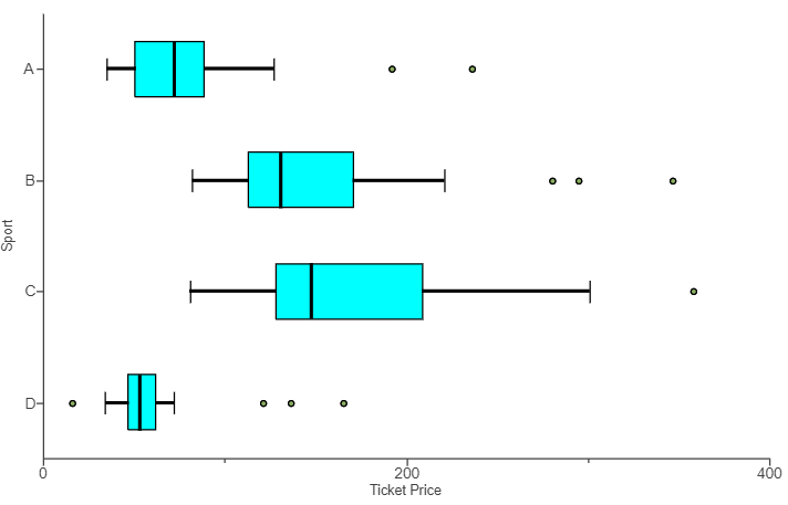
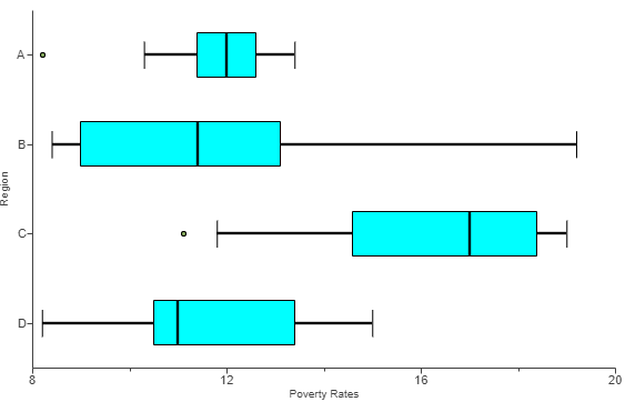
(a.) Which sport has the most expensive ticket​ prices?
(b.) Which sport has the least expensive ticket​ prices?
(c.) Compare the ticket prices for Sport A and Sport B.
In your​ comparison, compare the price of a typical​ ticket, the amount of variation in ticket​ prices, and the presence of any outliers in the data.


(a.) The sport with the most expensive ticket prices is Sport C because it has the greatest maximum ticket price.
(b.) The sport with the most expensive ticket prices is Sport D because it has the least minimum ticket price.
(c.) A typical ticket for Sport A is less expensive than a typical ticket for Sport ​B, since Sport A has a lower median than Sport B.
Sport B has more variability in ticket​ prices, as shown by a higher IQR (the length of the box...without the whiskers).
Sport A has potential outliers representing unusually high-priced tickets.
Sport B has potential outliers representing unusually high-priced tickets.
(10.) Determine the five-number summary for the dataset

$ 70\hspace{4em}71\hspace{4em}71\hspace{4em}71\hspace{4em}72 \\[3ex] 72\hspace{4em}74\hspace{4em}74\hspace{4em}76\hspace{4em}77 \\[3ex] 78\hspace{4em}78\hspace{4em}79\hspace{4em}79\hspace{4em}79 \\[3ex] $

The data is already arranged in ascending order.

$ n = 15 \\[3ex] Min = 70 \\[3ex] xth\;\;position = \dfrac{1}{4} * 15 = 3.75 \approx 4th\;\;position = 71 \\[5ex] Q_1 = 71 \\[3ex] xth\;\;position = \dfrac{2}{4} * 15 = 7.5 \approx 8th\;\;position = 74 \\[5ex] Q_2 = 74 \\[3ex] xth\;\;position = \dfrac{3}{4} * 15 = 11.25 \approx 12th\;\;position = 78 \\[5ex] Q_3 = 78 \\[3ex] Max = 79 \\[3ex] $ The five-number summary: 70, 71, 74, 78, 79
(11.) The dotplot shows the distribution of the heights​ (in feet) of a sample of roller coasters.

Number 11

The​ five-number summary of the data is given in the following table.
Minimum Lower Quartile Median Upper Quartile Maximum
2.393 8.009 18.086 33.313 129.414

(a.) Sketch a boxplot of the data.
(b.) Explain how you determined the length of the whiskers.


(a.) The sketch of the boxplot is:

Number 11

$ (b.) \\[3ex] Q_1 = 8.009 \\[3ex] Q_3 = 33.313 \\[3ex] IQR = Q_3 - Q_1 \\[3ex] IQR = 33.313 - 8.009 \\[3ex] IQR = 25.304 \\[3ex] LF = Q_1 - 1.5IQR \\[3ex] LF = 8.009 - 1.5(25.304) \\[3ex] LF = 8.009 - 37.956 \\[3ex] LF = -29.947 \\[5ex] UF = Q_3 + 1.5IQR \\[3ex] UF = 33.313 + 37.956 \\[3ex] UF = 71.269 \\[3ex] $ The length of the whiskers is determined as follows:
The minimum value is greater than or equal to the left limit (lower fence) of −29.947, so the left whisker is drawn to the minimum.
The maximum value is greater than the right limit (upper fence) of 71.269, so the right whisker is drawn to the largest non-outlier.
(12.)


(13.) Determine the five-number summary for the dataset

$ 5\hspace{3.7em}6\hspace{3.7em}6\hspace{3.3em}7\hspace{3em}10\hspace{3em}11 \\[3ex] 11\hspace{3em}12\hspace{3em}12\hspace{3em}17\hspace{3em}24\hspace{3em}29 \\[3ex] 32\hspace{3em}37\hspace{3em}42\hspace{3em}45\hspace{3em}54\hspace{3em}64 \\[3ex] $

The data is in ascending order.

$ n = 18 \\[3ex] Min = 5 \\[3ex] xth\;\;position = \dfrac{1}{4} * 18 = 4.5 \approx 5th\;\;position = 10 \\[5ex] Q_1 = 10 \\[3ex] xth\;\;position = \dfrac{2}{4} * 18 = 9 = \dfrac{9th\;\;position + 10th\;\;position}{2} = \dfrac{12 + 17}{2} = 14.5 \\[5ex] Q_2 = 14.5 \\[3ex] xth\;\;position = \dfrac{3}{4} * 18 = 13.5 \approx 14th\;\;position = 37 \\[5ex] Q_3 = 37 \\[3ex] Max = 64 \\[3ex] $ The five-number summary is: 5, 10, 14.5, 37, 64
(14.) Given these datasets, determine whether the boxplot can be used to represent the dataset.
Give reasons for your answers.

(a.) 44, 78, 80, 87, 95

(b.) 51, 72, 80, 86, 100


First, let us list the five-number summary
Then, we calculate the lower fence and upper fence
Then, we make our decision based on the comparing the minimum and the lower fence and/or the maximum and upper fence.

$ (a.) \\[3ex] 44, 78, 80, 87, 95 \\[3ex] minimum = 44 \\[3ex] Q_1 = 78 \\[3ex] Q_2 = 80 \\[3ex] Q_3 = 87 \\[3ex] maximum = 95 \\[3ex] IQR = Q_3 - Q_1 \\[3ex] IQR = 87 - 78 = 9 \\[3ex] 1.5IQR = 1.5(9) = 13.5 \\[3ex] LF = Q_1 - 1.5IQR \\[3ex] LF = 78 - 13.5 = 64.5 \\[3ex] 44 \lt 64.5 \\[3ex] $ The minimum value is less than the lower fence.
Between the minimum value and the lower fence, there may be some values greater than the minimum but less than the lower fence.
These values are unknown outliers.
Hence, the boxplot cannot be drawn for this dataset because the boxplot must mark all potential outliers.
Since the minimum is lower than the left​ limit, there may be other unknown outliers between the minimum and left​ limit, and so the boxplot cannot mark all potential outliers.

$ (b.) \\[3ex] 51, 72, 80, 86, 100 \\[3ex] minimum = 51 \\[3ex] Q_1 = 72 \\[3ex] Q_2 = 80 \\[3ex] Q_3 = 86 \\[3ex] maximum = 100 \\[3ex] IQR = Q_3 - Q_1 \\[3ex] IQR = 86 - 72 = 14 \\[3ex] 1.5IQR = 1.5(14) = 21 \\[3ex] LF = Q_1 - 1.5IQR \\[3ex] LF = 72 - 21 = 51 \\[3ex] 51 = 51 \\[3ex] $ The minimum is the lower fence.
So, there are no unknown outliers based on the lower fence.
Let us compare the maximum with the upper fence.

$ UF = Q_3 + 1.5IQR \\[3ex] UF = 86 + 21 = 107 \\[3ex] $ The maximum is lower than the upper fence.
This is in order because there is no other value in the dataset greater than the maximum.
It is possible to draw a boxplot based on this information.
Both the minimum and maximum are within the bounds of the left limit and right​ limit, which means that all potential outliers can be displayed.
This is necessary to construct the boxplot.
(15.) Data were collected on the industrial energy consumption per capita​ (in million​ BTUs) for some states.
A summary of the data is shown in the table below.
Summary Statistics:
Column Min Q1 Median Q3 Max
Industrial BTU 10.7 43.7 94.9 140.6 620.8

(a.) What percentage of the states consumed fewer than 43.7 million BTUs per​ capita?
(b.) What percentage of the states consumed fewer than 140.6 million BTUs per​ capita?
(c.) What percentage of the states consumed more than 94.9 million BTUs per​ capita?
(d.) Is there more variability in Total Energy Consumption or in Industrial Energy Consumption for the​ states?

Summary Statistics:
Column Min Q1 Median Q3 Max
Total BTU 189 228.4 305.4 380.4 914.5

(See the table below for data on total energy consumption per capita​ (in millions of​ BTUs) for the​ states.)


(a.) 43.7 million BTUs = Q1 = 25%
25% of the states consumed fewer than 43.7 million BTUs per capita.

(b.) 140.6 million BTUs = Q3 = 75%
75% of the states consumed fewer than 140.6 million BTUs per capita.

(c.) Median = 94.9 million BTU = 50%
More than 50% = 100 - 50% = 50%
50% of the states consumed more than 94.9 million BTUs per capita.

$ (d.) \\[3ex] \underline{Industrial\;\;BTU} \\[3ex] IQR = Q_3 - Q_1 \\[3ex] IQR = 140.6 - 43.7 = 96.9\;million\;BTUs \\[5ex] \underline{Total\;\;BTU} \\[3ex] IQR = Q_3 - Q_1 \\[3ex] IQR = 380.4 - 228.4 = 152\;million\;BTUs \\[5ex] 152\;million\;BTUs \gt 96.9\;million\;BTUs \\[3ex] $ There is more variability in Total Energy Consumption because it has an interquartile range of 152 million BTUs versus an interquartile range for Industrial Energy Consumption of 96.9 million BTUs.
(16.)


(17.) The boxplot shows the poverty rates​ (the proportion of the population below the​ government's official poverty​ level) in all states of a certain country.
The states are divided into four geographical​ regions: A,​ B, C, and D.

Number 17

(a.) List the regions from highest to lowest median poverty rate.
(b.) List the regions from lowest to highest interquartile range.
(c.) Do any of the regions have a state with an unusually low or an unusually high poverty​ rate? Explain.
(d.) Which region has the least amount of variability in poverty​ rate? Explain.
(e.) Why is the interquartile range a better measure of the variability for these data than the range​ is?


Scale:

$ \dfrac{12 - 8}{2} = \dfrac{4}{2} = 2 \\[5ex] 8, 10, 12, 14, 16, 18, 20 \\[3ex] $ (a.) Minimum Poverty Rates:
A = about 10.2
B = about 8.4
C = about 11.8
D = about 8.2
The regions from highest to lowest median poverty rate are: C, A, B, D

(b.) Interquartile Range is the length of the box: (approximate lengths are calculated)

$ IQR = Q_3 - Q_1 \\[3ex] A = 13 - 11 = 2 \\[3ex] B = 12.8 - 8.4 = 4.4 \\[3ex] C = 18.2 - 14.4 = 3.8 \\[3ex] D = 13.7 - 10.4 = 3.3 \\[3ex] $ The regions from lowest to highest interquartile range are: A, D, C, B

(c.) An unusually low or an unusually high poverty​ rate is an outlier.
Region A has a state with an unusually low poverty rate.
Region B has no state with an unusually low or high poverty rate.
Region C has a state with an unusually low poverty rate.
Region D has no state with an unusually low or high poverty rate.
Regions that have states with unusually low poverty rates have dots on the left side of their boxplots.
Regions that have states with unusually high poverty rates have dots on the right side of their boxplots.

(d.) Region A has the least amount of variability because it has the lowest interquartile range.

(e.) The range depends on only two observations, while the interquartile range depends on many observations and is therefore more reliable.
(18.)


(19.)


(20.) WASSCE In a community of 500 people, the 75th percentile age is 65 years while the 25th percentile age is 15 years.
How many of the people are between 15 and 65 years?


$ n = 500 \\[1em] \underline{65\:years} \\[1em] 75th\:\:percentile = \dfrac{75}{100} * 500 = 75 * 5 = 375 \\[2em] \underline{15\:years} \\[1em] 25th\:\:percentile = \dfrac{25}{100} * 500 = 25 * 5 = 125 \\[2em] \underline{Between\:15\:years\:\:and\:\:65\:years} \\[1em] 375 - 125 = 250\:people $


Top


(21.) The figure shows population density​ (people per square​ mile) for all states of a certain country.

Number 21

The states are divided into four geographical​ regions: A,​ B, C, and D.
(a.) Why is it best to compare medians and interquartile ranges for these​ data, rather than comparing means and standard​ deviations?

(b.) List the approximate median number of people per square mile for each​ location; for​ example, the median for Region A is approximately 255

(c.) List the regions from lowest interquartile range​ (on the​ left) to highest.


(a.) Some of these data have outliers​ and/or are​ skewed, and the median and interquartile range are resistant to outliers.

(b.) Scale on the x-axis:

$ \dfrac{50 - 0}{2} = \dfrac{50}{2} = 25 \\[5ex] $ The median for Region B (between 150 and 175) is about 170 people per square mile.
The median for Region C (between 500 and 525) is about 520 people per square mile.
The median for Region D (between 75 and 100) is about 95 people per square mile.

(c.) Interquartile Range is the length of the box: (approximate lengths are calculated)

$ IQR = Q_3 - Q_1 \\[3ex] A = 13 - 11 = 2 \\[3ex] B = 12.8 - 8.4 = 4.4 \\[3ex] C = 18.2 - 14.4 = 3.8 \\[3ex] D = 13.7 - 10.4 = 3.3 \\[3ex] $ The regions from lowest to highest interquartile range are: A, D, C, B
(22.)


(23.)


(24.)


(25.) The boxplot shows the percentage of the population that has earned a​ bachelor's (BA) degree in two different regions of a country.

Number 25

(a.) Estimate and interpret the median for Region A.
(b.) Estimate and interpret the median for Region B.
(c.) In which region does a greater percentage of the population have a BA​ degree?
(d.) Which region has more variation in BA​ attainment?


(a.) The median BA percentage for Region A is approximately is 23.6
(b.) The median BA percentage for Region B is approximately is 25.4
(c.) A greater percentage of the population has a BA degree in Region B because the median is larger for Region B.
(d.) Region B has greater variation than Region A because the interquartile range (IQR) for Region A is less than that for Region B.
(26.)


(27.) HSC Mathematics Standard 1 The heights, in centimetres, of 10 players on a basketball team are shown.
170, 180, 185, 188, 192, 193, 193, 194, 196, 202
Is the height of the shortest player on the team considered an outlier?
Justify your answer with calculations.


Fences: Lower Fence and Upper Fence determine outliers of data.
A data value is an outlier if it is less than the lower fence or greater than the upper fence.
Because the question asked for the height of the shortest player, we shall be concerned with only the Lower Fence.
Data is already sorted

$ n = 10 \\[3ex] \dfrac{1}{4} * 10 \\[5ex] = 2.5th \approx 3rd\;\;position \\[3ex] Q_1 = 185 \\[5ex] \dfrac{3}{4} * 10 \\[5ex] = 7.5th \approx 8th\;\;position \\[3ex] Q_3 = 194 \\[5ex] IQR = Q_3 - Q_1 \\[3ex] IQR = 194 - 185 \\[3ex] IQR = 9 \\[3ex] LF = Q_1 - 1.5(IQR) \\[3ex] LF = 185 - 1.5(9) \\[3ex] LF = 185 - 13.5 \\[3ex] LF = 171.5 \\[3ex] $ Because the height of the shortest player is 170 cm and 170 < 171.5; the height of the shortest player is an outlier.
(28.)


(29.)


(30.)


(31.) The data show the number of central public libraries in 30 states and the District of Columbia.

Number 31

A summary of the data is shown in the following table.
Summary Statistics
Variable n Mean Std. Dev. Median Minimum Maximum Q1 Q3
Central Public Libraries 31 203.19355 201.46586 102 1 756 79 318

Should the maximum and minimum values of this data set be considered potential​ outliers? Why or why​ not?
You can check your answer by using technology to make a boxplot using fences to identify potential outliers.

(a.) Should the maximum value of this data set be considered a potential​ outlier?
Why or why​ not?

(b.) Should the minimum value of this data set be considered a potential​ outlier?
Why or why​ not?


$ (a.) \\[3ex] IQR = Q_3 - Q_1 \\[3ex] IQR = 318 - 79 \\[3ex] IQR = 239 \\[3ex] UF = Q_3 + 1.5IQR \\[3ex] UF = 318 + 1.5(239) \\[3ex] UF = 318 + 358.5 \\[3ex] UF = 676.5 \\[3ex] Maximum = 756 \\[3ex] 756 \gt 676.5 \\[3ex] $ Because the maximum value, 756 is greater than the upper fence (right limit), 676.5, the value is considered a potential outlier.

$ (b.) \\[3ex] LF = Q_1 - 1.5IQR \\[3ex] LF = 79 - 1.5(239) \\[3ex] LF = 79 - 358.5 \\[3ex] LF = -279.5 \\[3ex] Minimum = 1 \\[3ex] -279.5 \lt 1 \\[3ex] $ Because the minimum value, 1 is greater than the lower fence (left limit), -279.5, the value is not considered a potential outlier.
(32.) The data show the gas taxes in 30 states and the District of Columbia.

Number 32

A summary of the data is shown in the following table.
Summary Statistics
Column n Std. Dev. Median Min Max Q1 Q3
Gas Taxes (ct/gal) 31 7.46543 47 32.9 62.9 39.8 51

Should the maximum and minimum values of this data set be considered potential​ outliers? Why or why​ not?
You can check your answer by using technology to make a boxplot using fences to identify potential outliers.

(a.) Should the maximum value of this data set be considered a potential​ outlier?
Why or why​ not?

(b.) Should the minimum value of this data set be considered a potential​ outlier?
Why or why​ not?


$ (a.) \\[3ex] IQR = Q_3 - Q_1 \\[3ex] IQR = 51 - 39.8 \\[3ex] IQR = 11.2 \\[3ex] UF = Q_3 + 1.5IQR \\[3ex] UF = 51 + 1.5(11.2) \\[3ex] UF = 51 + 16.8 \\[3ex] UF = 67.8 \\[3ex] Maximum = 62.9 \\[3ex] 62.9 \lt 67.8 \\[3ex] $ Because the maximum value, 62.9 is less than the upper fence (right limit), 67.8, the value is not considered a potential outlier.

$ (b.) \\[3ex] LF = Q_1 - 1.5IQR \\[3ex] LF = 39.8 - 1.5(11.2) \\[3ex] LF = 39.8 - 16.8 \\[3ex] LF = 23 \\[3ex] Minimum = 32.9 \\[3ex] 32.9 \gt 23 \\[3ex] $ Because the minimum value, 32.9 is greater than the lower fence (left limit), 23, the value is not considered a potential outlier.
(33.)


(34.)


(35.) The dotplot shows the distribution of passing rates for the bar exam at 185 law schools in the United States in a certain year.

Number 35

The five number summary is 26​, 78​, 87, ​91, 100.
(a.) Draw a boxplot of the data.
(b.) Explain how you determined where the whiskers go.


(a.) The sketch of the boxplot is:

Number 35

$ (b.) \\[3ex] Q_1 = 78 \\[3ex] Q_3 = 91 \\[3ex] IQR = Q_3 - Q_1 \\[3ex] IQR = 91 - 78 \\[3ex] IQR = 13 \\[3ex] LF = Q_1 - 1.5IQR \\[3ex] LF = 78 - 1.5(13) \\[3ex] LF = 78 - 19.5 \\[3ex] LF = 58.5 \\[5ex] UF = Q_3 + 1.5IQR \\[3ex] UF = 91 + 19.5 \\[3ex] UF = 110.5 \\[3ex] $ The whiskers extend to the most extreme values that are not potential outliers.
The left whisker extends to the smallest observation that is greater than or equal to 58.5​, and the right whisker extends to the largest observation that is less than or equal to 110.5
(36.)


(37.)


(38.)


(39.)


(40.)


Top


(41.)


(42.)